Before
alphabroder
Branding Refresh


After
In 2021, alphabroder began a years-long process of combining its two websites, alphabroder.com and primeline.com. This major undertaking provided an opportunity to refresh our longstanding brand identity.
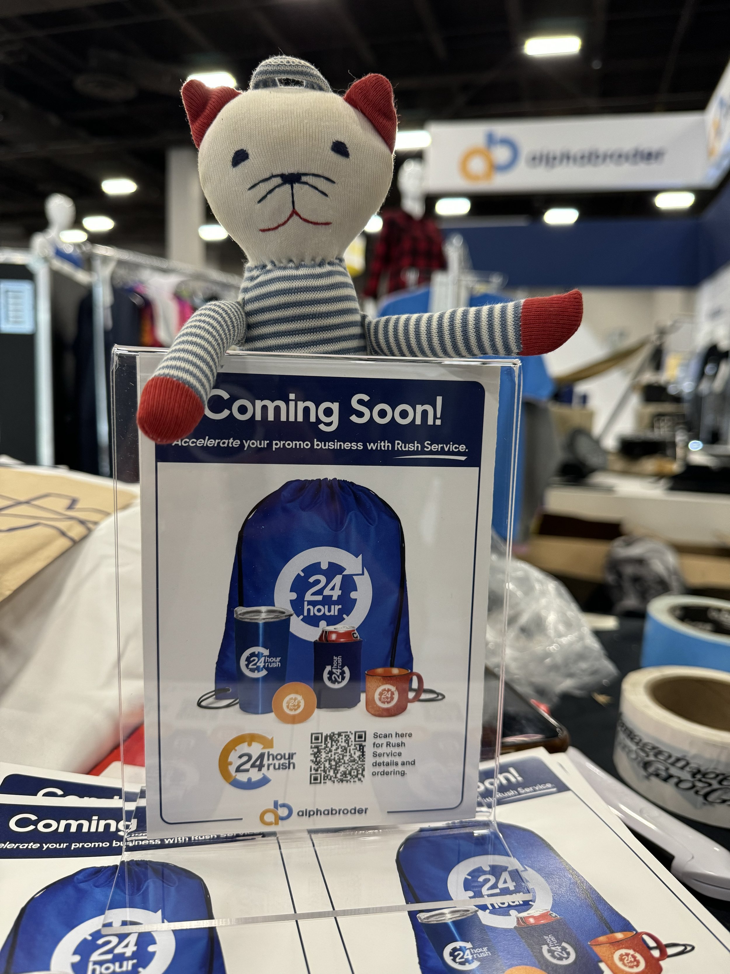
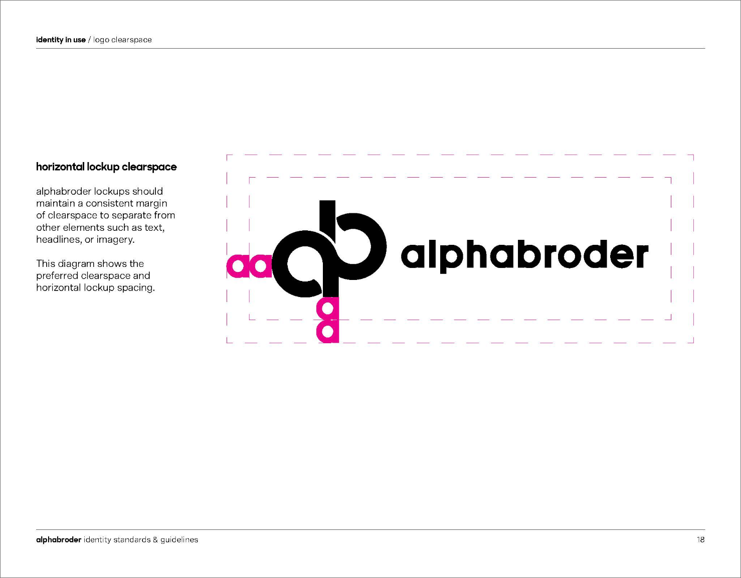
Since joining alphabroder, I encountered numerous challenges with the existing logo. The colors were muted, making it difficult to stand out among competitors. The thin line weight impacted readability, and, most importantly, the logo was hard to embroider and screenprint on our apparel. Given that we sold products to be decorated, our logo was often barely visible on the very items it was meant to brand.
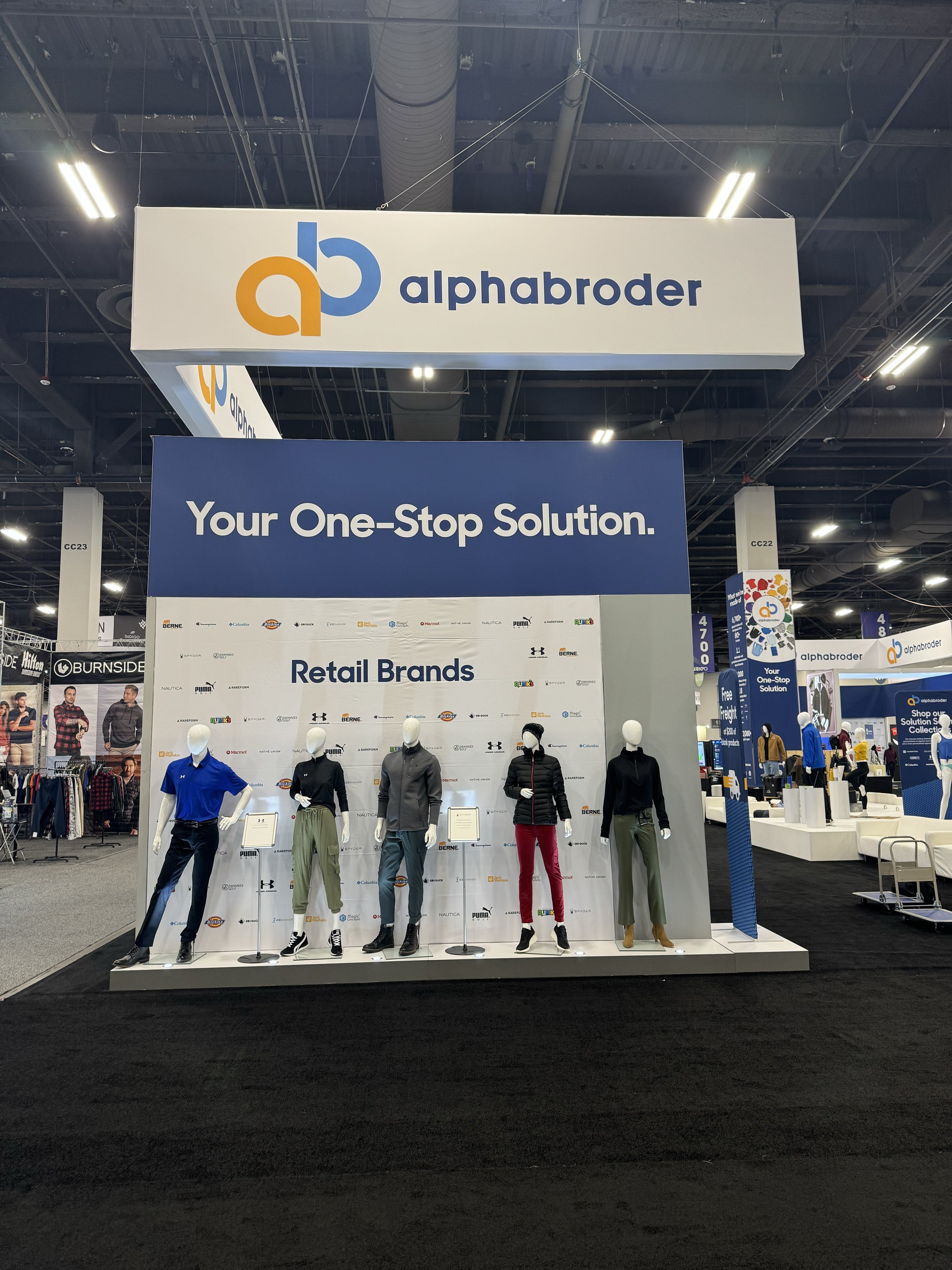
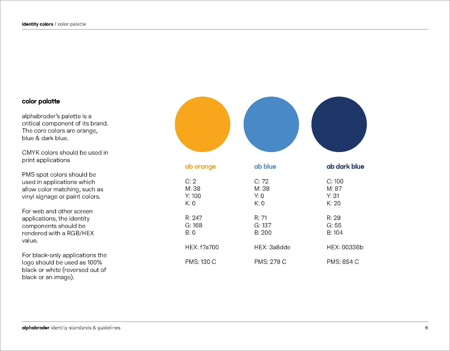
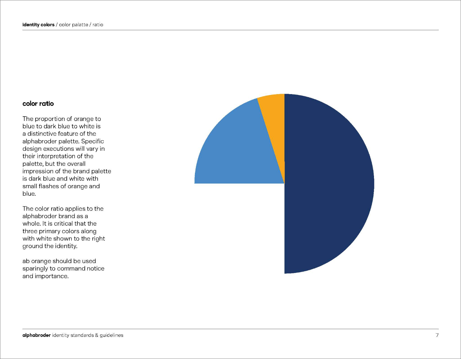
Advocating for a redesign to the executive team and board of directors was a lengthy but rewarding process. After a thorough rebranding exercise, we reached a unanimous decision to address these issues while preserving the brand recognition we had built over the years. The result was a brighter, more vibrant logo—one that stood out in the marketplace and complemented our newly improved website.
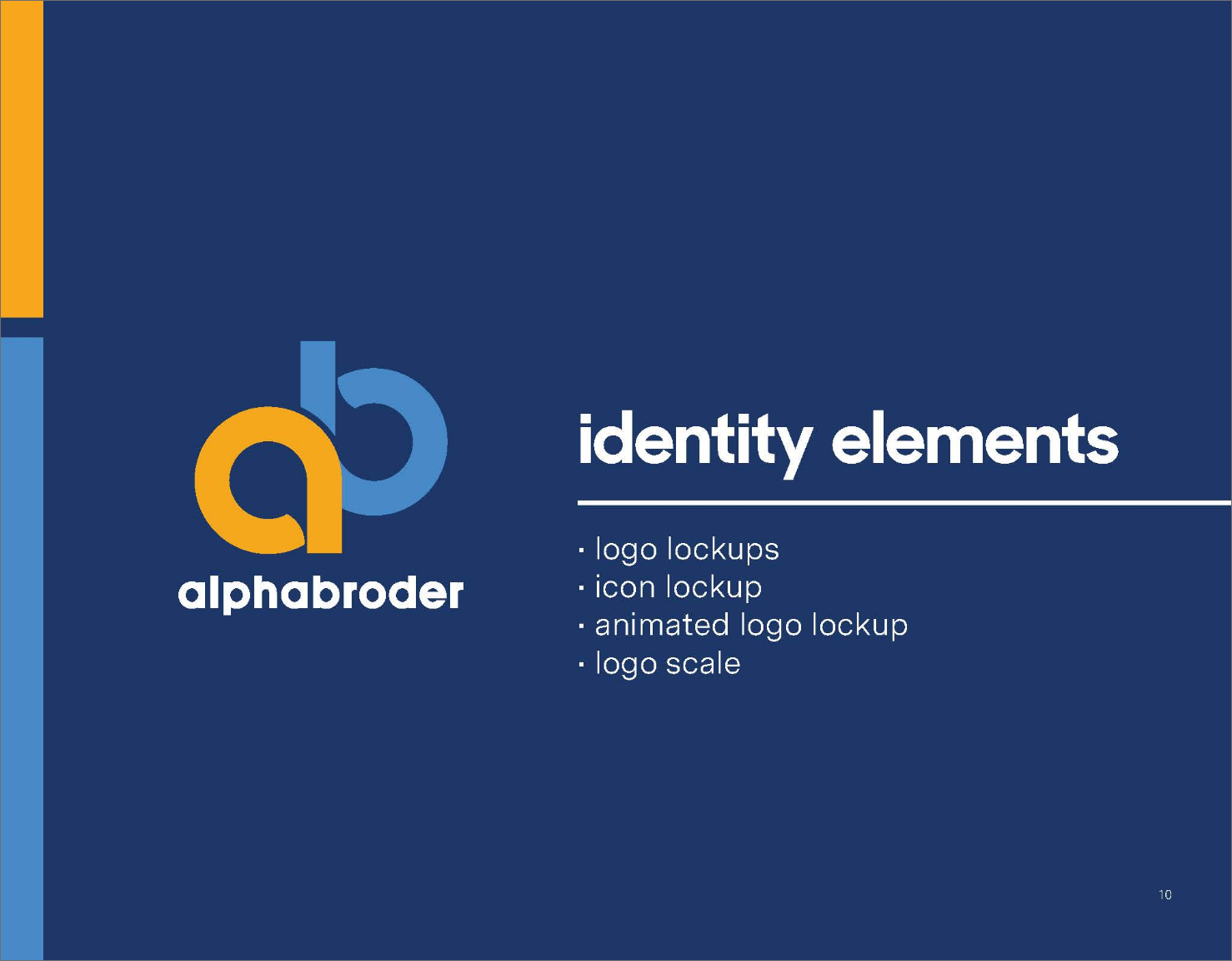
Creative Direction
In-House
alphabroder
Credits
Art Director: Todd Loessy
Designers: Amanda Campofiore, Ryan McCluskey
Logo Animation: Andrew Hutcheon
Video Production: Napco Media

Usage Before

Redesign Sketches


Click to view


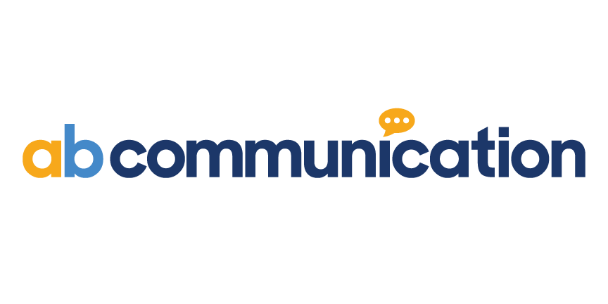
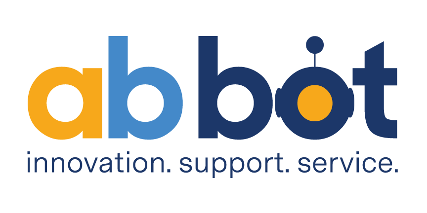
Internal Communication Logos
Internal Communication Logos
Internal Communication Logos
Internal Communication Logos

Internal Communication Logos